This map is a map of the city of Buffalo, New York. it shows the percentage of children age 5 to 17 in each section of the city.
Before

After

The original map was horrible. It was small and hard to read with way too much white space. The data and legend were good, but it said “Legend” in the legend, which is bad. The first map had 2 scales on it so I removed the scale bar. There were also a large number of neatlines I had to remove from the first map. One reason why the original map was so bad was because I wasn’t as experienced with the software, and each time I use it I get a little better. The main improvement was the size of the map, which I think makes it MUCH better.
Before
This map is also of Buffalo, New York. This one shows the dominant race in each section of city. Whites and Blacks seem to have higher populations than Hispanics.

After

I had to make many changes to the Racial group map. The original was bad. Too small, WAY too much white space, and a very screwed up legend. The data was there, and the map itself didn’t change too much other than the colors, but the revised version actually looks good and makes you want to read it. I changed the map title and legend. The original legend was bad and said “legend” and had an extra meaningless box. The new legend is simple and easy to read. I changed the map colors a little bit and I feel like it looks better now and will look good on a blog. Lastly, I added my data source. (I think it is census data, but I’m not positive)
This map shows some rivers in Idaho. It is not really a useful map, it just shows I know about line smoothing.
Before

After

This is not a good map. The revised map isn’t very good either, but at least it looks prettier. This map is not useful to anybody, because it doesn’t really show any useful information. It just shows that I know how to simplify lines in ArcGIS. The revised map does look better however. I made the lines thicker and easier to see, changed the legend so it no longer says “legend” (a common problem in my original maps), and added the source data information. I also changed my extra fancy North Arrow to a less distracting, simpler North Arrow. I don’t think this map is supposed to be great, it’s just to show that I know how to simplify lines.
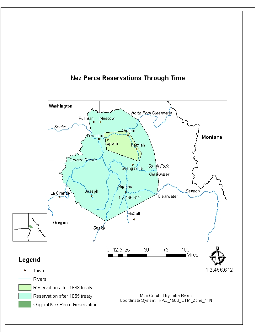
This map shows the Nez Perce Indian Reservation in Northern Idaho through time. Starting in 1855 it shows that the reservation has shrunk 3 times and is now a fraction of its original size.
Before
After

I actually liked the original map. It looked ok and had good labels. Sadly they weren’t quite right. I did not know about the automatic “show labels” button. So I just used text boxes to label everything. And I don’t think my data was even correct for the first map. I kind of moved the towns around so they weren’t as ac curate as the new map. Also, my legend is very screwed up in the first map. It shows things that aren’t on the map, and some of the things the legend shows are different colors on the map, making my legend and map useless. The new one is MUCH better. The inset map actually looks proper in the new map. Of course I fixed other obvious things like balancing white space and using a simpler North arrow.
No comments:
Post a Comment