For my course project, I created a dot map showing deaths in the video game Counter-Strike: Source, and a choropleth map of Bigfoot Sightings in Idaho. The Counter-Strike map is similar to a heatmap showing the densities of deaths on the level de_dust. A friend and I collected the data ourselves (about 90 games worth) and I created the map using Gimp. The Bigfoot sightings map shows Bigfoot sightings by county. I got the data from the Bigfoot Field Researcher’s Organization, and created the map using ArcMap. ..... (This is an animated .gif Click on it to see it work!)
My first map(lab6) is a map showing the density of Asian people in Idaho.It also shows the forest service land of the state.While these two things don't seem to go hand in hand, it does show that most Asians are not living in forest service land, and that the majority of them are living in the Boise area.
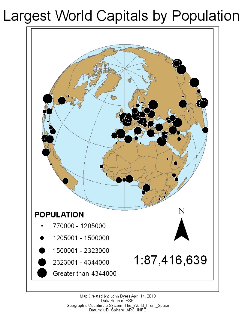
My second map (lab6b1) shows the relative size of the world's largest capitals (over 750,000 people).It is a very cool map.
My third map (lab6b2) shows the percentage of women living in each section of Buffalo, New York.The distribution of women is basically 50% throughout the city with a few exceptions in the southwestern part.I used the "woman" symbol as I think it represents women to anybody who has ever had to use a public restroom.
This is a map of Deer Valley Resort in Park City, Utah. It is a VERY cool place. I've always thought ski route maps were very interesting. I got this map from www.sangres.com
This is one of my favorite maps. It is a very old map of the world. As you can see, North America is unexplored so it doesn't really end. Same with Australia. The continents look correct for the most part but they are just a bit off. Plate Tectonics? I doubt it. Whoever made this map did a great job for the time period. I got this map from paddlinginstructor.com
Continuing with my video game map of the week theme, here is a map from Super Mario World. This is a small scale map of the game, and actually makes the world look small. I got this picture from desktopgaming.com
These are the maps I made in Lab 5. They show some different interpolation methods. The purple one shows Kriging and the blue one shows Inverse Distance Weighted. I like the purple one better. Its labels are easier to read.
This is a heatmap of High Ground, a Halo 3 level. This particular heatmap is showing deaths. The bright red areas are where the most people get killed each game. There are heatmaps for each level on http://www.bungie.net/Online/Heatmaps.aspx
This is a map of de_dust2 from the video game Counterstrike Source. This map is extremely popular, and may very well be the most played first person shooter level of all time. Each little section of map is labeled. Ask any counterstrike nerd about "T spawn" or "B" and they will know exactly what and more importantly WHERE you are talking about!
This is a general purpose map of the Boulder County, Colorado. I created it using Macromedia FreeHand. It shows the major roads, rivers, parks, and urban areas of the county.
Before
After
This map was much harder to make as I am inexperienced with using Freehand. The original map and the updated map are not too different. The updated map is bigger and there is less white space. I also added a much needed legend. I also added a data source and North arrow and changed the font a little bit.
This is a map of Cyrodiil, the world from the video game "Oblvion". It is a pretty awesome map with every little cave and ruin marked with a symbol. I got this map from hermannk.org
Here is my lab 3 map before and after its update!
This is a map I created using US census data from the year 2000. It shows the percentage of white people per county in Idaho (which is a lot, so don't be confused by the big numbers!)
It is actually 4 separate maps, each showing a different method of classifying data. Natural Breaks, Quantities, Equal Interval, and Optimal is shown. As you can see, Idaho is a predominately white state.
Before
After
Lab 3 was my most recent map that I created.It is in a different league than those original Lab1 maps I created, but it still had room for improvement.First, I changed the map so it fit on normal, printable pages.I also decided to change it from “landscape” to “portrait” because Idaho is a tall, semi-skinny state, making “portrait” mode a more natural choice.I also changed the obnoxious fancy North Arrow to a better one.The map hasn’t really changed much, but it is bigger and easier to read now in the same amount of space as the original.
These are the first maps I made in this class. They aren't the best. The data is accurate, but they look bad. So I've revised them. Here is the "before" and "after"!
This map is a map of the city of Buffalo, New York. it shows the percentage of children age 5 to 17 in each section of the city.
Before
After
The original map was horrible.It was small and hard to read with way too much white space.The data and legend were good, but it said “Legend” in the legend, which is bad.The first map had 2 scales on it so I removed the scale bar.There were also a large number of neatlines I had to remove from the first map.One reason why the original map was so bad was because I wasn’t as experienced with the software, and each time I use it I get a little better.The main improvement was the size of the map, which I think makes it MUCH better.
Before
This map is also of Buffalo, New York. This one shows the dominant race in each section of city. Whites and Blacks seem to have higher populations than Hispanics.
After
I had to make many changes to the Racial group map.The original was bad.Too small, WAY too much white space, and a very screwed up legend.The data was there, and the map itself didn’t change too much other than the colors, but the revised version actually looks good and makes you want to read it.I changed the map title and legend.The original legend was bad and said “legend” and had an extra meaningless box.The new legend is simple and easy to read.I changed the map colors a little bit and I feel like it looks better now and will look good on a blog.Lastly, I added my data source. (I think it is census data, but I’m not positive)
This map shows some rivers in Idaho. It is not really a useful map, it just shows I know about line smoothing.
Before
After
This is not a good map.The revised map isn’t very good either, but at least it looks prettier.This map is not useful to anybody, because it doesn’t really show any useful information.It just shows that I know how to simplify lines in ArcGIS.The revised map does look better however.I made the lines thicker and easier to see, changed the legend so it no longer says “legend” (a common problem in my original maps), and added the source data information.I also changed my extra fancy North Arrow to a less distracting, simpler North Arrow.I don’t think this map is supposed to be great, it’s just to show that I know how to simplify lines.
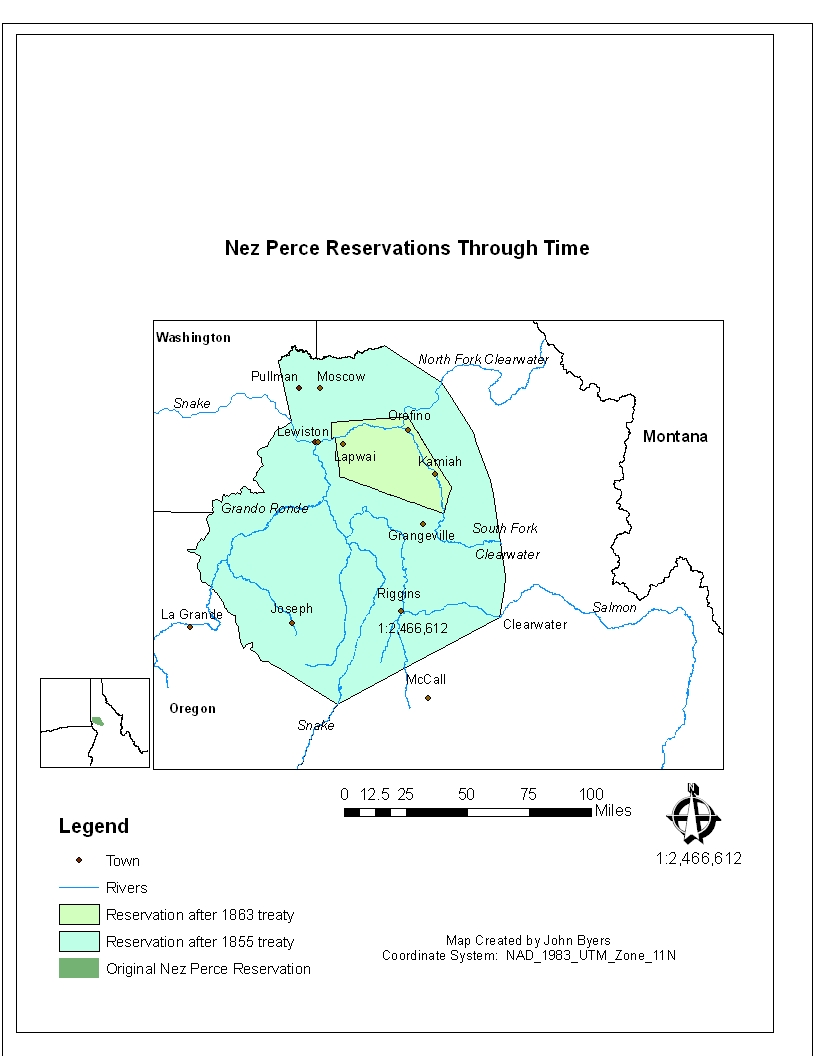
This map shows the Nez Perce Indian Reservation in Northern Idaho through time. Starting in 1855 it shows that the reservation has shrunk 3 times and is now a fraction of its original size.
Before
After
I actually liked the original map.It looked ok and had good labels.Sadly they weren’t quite right. I did not know about the automatic “show labels” button.So I just used text boxes to label everything.And I don’t think my data was even correct for the first map.I kind of moved the towns around so they weren’t as ac curate as the new map.Also, my legend is very screwed up in the first map. It shows things that aren’t on the map, and some of the things the legend shows are different colors on the map, making my legend and map useless.The new one is MUCH better. The inset map actually looks proper in the new map.Of course I fixed other obvious things like balancing white space and using a simpler North arrow.


